TONi Harmony
The design system behind Grid, Insights and Keep. Colour, type, space, radius, elevation and motion are defined once as tokens, and every surface in every product reads from them. This page is the living reference — everything below renders from the same stylesheet the products use.
1. Brand Logos
The logo is a 3×3 grid of rounded squares joined by connective strokes — Grid, drawn literally. Three cuts cover every context. Click any asset to open it full-screen.
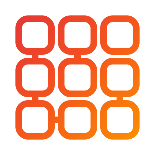
Outline
Gradient. 64px and above only.
logo.svg
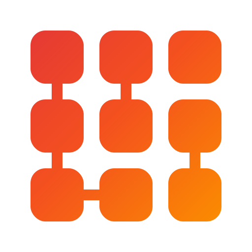
Solid
Gradient. 48px and below, and the favicon.
logo-solid.svg

Outline — Black / White
Color changes based on theme
logo-white.svg

Solid — Black / White
Color changes based on theme
logo-white-solid.svg
Wordmark
Inlined here so it renders in the page's own Onest — the standalone SVG still uses live text, not outlined paths, so treat it as pending until that conversion happens.
wordmark.svg
Size behaviour
The outline cut's counters close up below roughly 48px. This is the one rule most often broken by accident, because the outline looks correct in a design tool at any size.
Outline — breaks down
96
48
24
16
Solid — holds
96
48
24
16
2. Application Icons
Each platform crops, masks and pads differently, so one master cannot serve them all. Four geometries cover every install target.

Universal
iOS, PWA, stores. Logo at 60%.

Maskable
Logo at 46% — survives a circle crop.

macOS
Supplies its own squircle and margin.
Android
Two layers. Logo inside the 66% safe zone.
3. Colour
Two brand colours, one warm-tinted neutral ramp, and functional status colour. Destructive is deliberately not the brand red — it is deeper, cooler, and never carries a gradient, so confirm and delete cannot be confused. Click any swatch to copy its token.
Brand & Status
Neutral ramp
Warm-tinted, so neutrals never read colder than the brand sitting next to them.
4. Type
Onest across the interface, 11 through 60. Headings are plain by default — the brand
gradient is an opt-in .text-gradient class for
marketing display type, never an element rule.
Display, opt-in
--font-primary
Onest
TONi is a personal computing platform that keeps its intelligence local. Grid is its workspace at toni.ng, free to join, with Insights today and Keep in development.
Mono
--font-mono
JetBrains Mono
const example = () => {
  console.log("Hello TONi");
};
example();
5. Space, Radius & Elevation
The three scales that did not exist before. Elevation in particular was four shadow strings copy-pasted across buttons, surfaces, dropdowns and modals; it is now one token each.
Space — 4px base
Radius
Elevation
Four levels, so a card and a modal are no longer the same weight.
6. Surfaces
Flat at a 30px radius by default — no blur, no transparency, reads the same over any
background. .surface-blur is the one exception:
modals, dropdown menus, context menus and alerts share a single blur recipe so nothing
floating above the page redeclares its own. Theme differences are handled by tokens,
so there is no parallel dark-mode copy of every rule.
Flat
The bare .surface default. Lightest shadow. Dense lists and table rows.
.surface-flat
Blur
The one surface with blur. Heaviest elevation — modals, dropdown menus, context menus, alerts.
.surface-blur
7. Buttons & Action States
Every variant is one class at equal specificity, with no
!important anywhere, so a new variant can be added
without fighting the cascade. Click any button for feedback.
Variants
Gradient means primary action, and only primary action.
Destructive
Outline-first. The filled cut is reserved for the final confirm step inside a dialog — never for an inline delete.
Sizes
Three steps off the type and space scales.
Icon controls
44px minimum hit area, regardless of glyph size.
8. Popups, Alerts & Notifications
Real notifications, toasts and modals, powered by the shell.
System Popups
Click any button below to trigger a live system alert or modal.
Status pills
Functional colour only — never decorative.
9. Icon Systems
Two datasets, one engine. Material Symbols (system glyphs, UI controls) and Simple
Icons (third-party brands) both compile to a build-time CSS mask at
pnpm toni:iconify — no webfont, nothing shipped that
isn't actually used on the page. Both inherit
currentColor and size from
--icon-size.
Material Symbols
.material (shared sizing/motion hook) +
.material-{name} (generated mask), Rounded style.
Simple Icons
.si-{name} — the class alone is enough.
10. Loading
Different states for loading content.
Logo Loader
Gradient logo, an animated nine cells filling in snake order.
Logo Mono Loader
Pure black, flipping to pure white in dark theme.
Skeleton Loader
Shimmer block, for known layout and unknown content.
11. Media Viewer
Click either tile to open the lightbox. The video is a public sample clip used only to confirm playback controls work — not a shipped asset.
Image
Opens with zoom, rotate and reset controls.

Video
Opens with play/pause, seek, volume, loop and fullscreen controls.